Here is my video I created showcasing my original font that was inspired by the novel “House of Leaves.” Enjoy!
Month: June 2013
Final Project Breakdown
Last week I was quite satisfied with the prospect of making a calligraphy style font for my final project. Yet, somehow in the course of a week everything has changed. When fellow “cohortee” Vone made a comment stating that it would be interesting to see a font inspired by “House of Leaves,” I started thinking. What would an HoL font look like? What I came up with ended up being a text designed to reflect the structural oddities found in the book, and some that portrayed a similar emotional message concurrent with the book. One of the biggest challenges I faced was how to create a letter that is bigger on the inside than the outside (like HoL’s mysterious house)? After much experimenting It finally came to me and the letter “A” was born. Next I wanted to look back through HoL in hopes of finding some inspiration for other letters. One page that really intrigued me 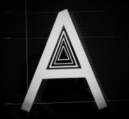 was the one in which the text seems to be falling apart. Hence the creation of “E”. With letters like “Q” I hoped to capture the creepy aspects of the book. Many letters are also oriented in strange manners to mirror the sections in the book that are written in odd directions, some upside-down or sideways. From this I created letters like i which looks more like !. My favorite letter is definitely “U” but
 I’ll save that for the debut.
When entering in to our discussion this week I still had two very important question I needed to answer. The first being what to name my font, and the second what to do about the lowercase letters. One of my main goals was to make the font terrifyingly odd, but still readable. Thus, I didn’t want the lowercase to be quite so out of the box. With the help of my instructor Jesse both dilemmas were solv
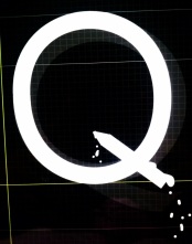 ed. We decided to name the font “Viscera” because of the emotional response it invokes. Secondly, I made the lowercase font all appear hollow which to me works on two levels. On one hand the hollow letters are like the vast empty hallway, and on the other they are much like the empty life Johnny Truant leads.
To display “Viscera” Im hoping to create a video that showcases each letter and also shows it in use. Hopefully, I can create something that is concurrent with the mood of the type.
Final Project
Inspired by the film Helvetica, I’ve decided to create my own font via the app “IFontMaker” for my final project. Ive decided to create something with an asian calligraphy feel, because thats something I’m drawn toward; but since this just the brainstorming stage thats subject to change. Ive learned from mu research that this is called a “Humanist” typeface (sort of fits with digital humanities I think). Its a bit nerve racking for me since my perfectionism will probably make this project soak up a lot of time, but Im none the less excited. I’d say the outline for my project would be ” to create an original font of the complete alphabet (perhaps even some symbols) and showcase it in a unique and interesting way.” Here is an example of what the program looks like and my current creation on “A.”

